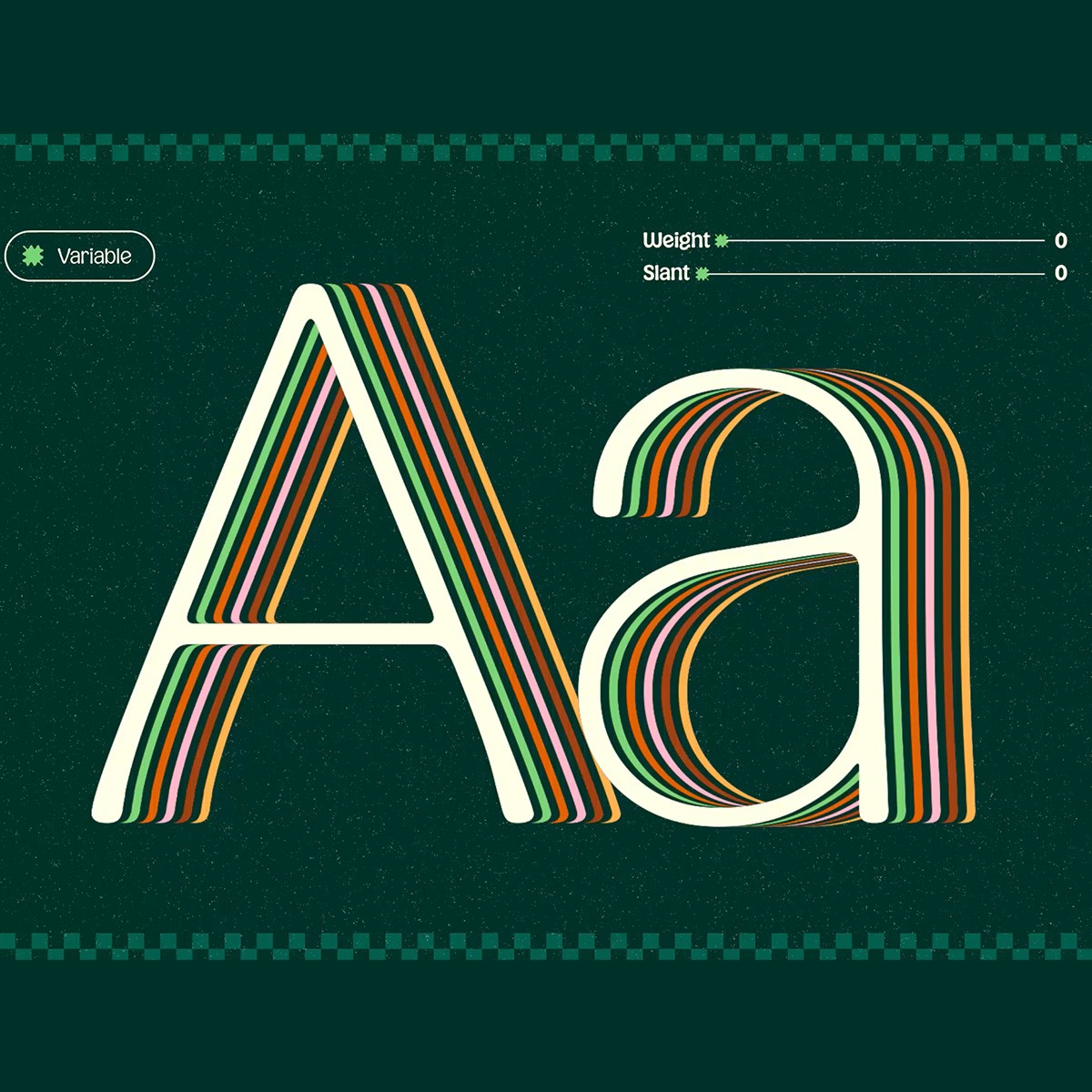
Kogi™ has a clear and balanced voice. Its rounded serifs soften the overall tone while maintaining a strong visual presence, creating a typeface that feels both welcoming and confident. It naturally fits food-related projects, where generosity and appetite appeal are essential, but its versatility allows it to adapt just as well to any design that aims for warmth, openness, and a sense of human connection.
Logos, posters, packaging, magazine covers, or visual identities—Kogi™ works wherever impact and generosity are needed. It performs especially well in food-related projects, bringing warmth and appetite appeal while remaining clear and structured. Designed to be versatile and reliable, it supports strong visual statements without overpowering them.